The Portland Winterhawks retire borrowed logo of 45 years to varied reception
The local ice hockey team replaced their logo for the first time in 45 years. Winterhawks majority owner Michael Kramer unveiled the new design earlier this summer.
Since the team’s birth in 1966, the Winterhawks had borrowed the logo of the National Hockey League’s Chicago Blackhawks. According to Kramer, before their inaugural season, the Winterhawks could not afford their own jerseys. A solution came when then-owner Brian Shaw accepted a pile of spare Blackhawks jerseys for his team.
The new logo marked a turning point in Winterhawks history, with it being the Winterhawks’ first logo to be unique to them. Kramer stressed the importance of the new identity at the logo’s unveiling on Jul. 14.
“We are not from Chicago,” Kramer said. “We are from Portland. We are the Winterhawks, and we deserve our own identity.”
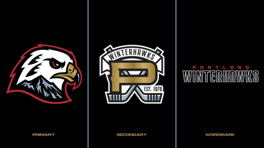
The logo includes a white red-tailed hawk decorated with heritage feathers to pay homage to its predecessor. Also present on the logo is Mount Hood, with the team’s initials—W and H— carved into it.
Brian Gundell, owner of Brian Gundell Graphic Design Company and the logo’s designer, felt that the inclusion of Mount Hood in the logo represented the city of Portland well.
“There’s really no part of the [Portland metro area] where you can’t see Mount Hood at some point, you know, if it’s a clear day,” Gundell said. “So, to me, [Mount Hood is] like, that’s the most synonymous thing with the entire area.”
The red-tailed hawk was chosen for the logo both because of its prevalence in Oregon, according to Gundell, but also its status as a bird of prey.
“[Now the Portland Winterhawks] have a logo that represents how we play,” head coach Mike Johnston said at the logo unveiling. “That attacking, aggressive, up-tempo style of play.”
The Winterhawks logo change is also one heavily lobbied for by members of the Native American community. The old logo, which depicted a Native American man wearing face paint and a headdress, has been a longstanding point of contention among Winterhawks fans.
Paul Lumley, executive director of the Native American Youth and Family Center, was an outspoken advocate for the logo change. Last year his organization started a petition to change the logo which gathered over 4,000 signatures. While Lumley appreciated the retirement of the old logo, he said there was a lack of accountability on the part of the Winterhawks organization.
“It’s great that the Winterhawks finally came to the conclusion to retire the old logo,” Lumley said, “but in the process of doing so, they refused to acknowledge the past and [the harm the old logo caused], and in fact, they said they were doing it on their own without encouragement from anybody.”
The primary logo wasn’t the only one revised; the secondary logo and wordmark have been reworked as well. The secondary logo is a familiar one for the Winterhawks, featuring the wide-set P they have worn before, now with a gradient and crossed hockey sticks behind it. The new logos included two new colors for the Winterhawks, called squall grey and “celly gold.”
Mattias Osterberg, a junior at Gladstone High School who has been a Winterhawks fan since he was four, said he felt that while the old logo was classic, the new one is really cool and sets the team apart from the Blackhawks. Osterberg also plays hockey for the Portland Jr. Winterhawks, where he has noticed the impact of the logo change on his team.
“[The team loves] the new logo, and I think it looks really cool,” Osterberg said. “They did a really good job with it and I think it just brings a new energy into the locker room…”
The Portland Winterhawks’ first regular season game with the new logo was on Oct. 1 against the Tri-City Americans in Kennewick, Wash, where the Winterhawks were defeated 5-4.
Lincoln Wheeler (he/him) is a senior who loves playing hockey and guitar. He enjoys being a journalist because he wants to bring new perspectives and ideas to people.


